Windows Start Icons
What is it?
Over time, the Windows Start icon has undergone many changes, so much so that some users may not even recognize its name or know what it is, yet Windows users, use it all the time.
Since its introduction, the Start icon has evolved dramatically, mirroring shifts in design aesthetics, branding strategies, and user interface principles. Below is a timeline highlighting its transformation across major Windows versions:
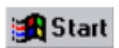
Windows 95 – The Beginning (1995)
- Windows Start Icon: Introduced the Start button
- Design: A rectangular button labelled “Start” with the classic 4-colored Windows logo.
- Function: Opened the Start Menu—a revolutionary new user interface (UI) element for accessing programs, documents, and settings.
- Notable: Coined the phrase “Click Start to shut down.”
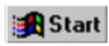
Windows 98 / ME / 2000
- Icon: Similar to Windows 95, but with a sleeker and slightly more polished appearance.
- Logo: Still used the classic waving Windows flag with bold colours.

Windows XP (2001)
· Design Shift: Start button now had a green rounded rectangle.
· Text: Labelled with “Start” and included the Windows flag.
· Logo: Windows flag became glossier and more 3D-like, matching XP’s colourful, friendly aesthetic.

Windows Vista / Windows 7 (2006–2009)
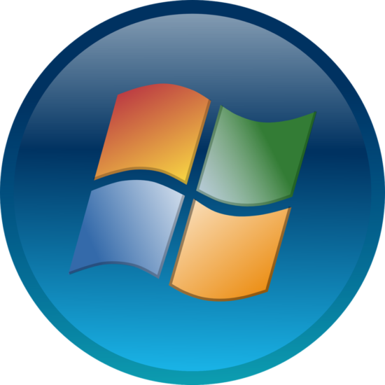
- Start Orb: The rectangular Start button was replaced by a circular “Start Orb”.
- Logo: 3D, glass-like Windows logo in red, green, blue, and yellow.
- Text Removed: No more “Start” label—just the orb.
- Look: Glossy, glowing, and animated with Aero Glass UI.
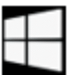
Windows 8 / 8.1 (2012–2013)
- Major Overhaul: Start button was initially removed in Windows 8.
- Backlash: Due to user demand, Windows 8.1 reintroduced a flat Windows logo (white on black) in the taskbar.
- Interface: Clicking the icon opened the Metro Interface or Start Screen, not a traditional Start Menu.
Windows 10 (2015)
- Icon: Simplified, flat white Windows logo (four panes) on a dark or transparent taskbar.
- Design: Modern, minimal, adapting to light or dark themes.
- Start Menu Returned: Combined traditional menu with live tiles from Windows 8.
Windows 11 (2021)
- Centred Taskbar: Start icon is now centred by default (though it can be aligned left).
- Icon: A symmetrical flat white Windows logo—no waving or tilt.
- Design Philosophy: Clean, modern, focused on simplicity and fluid UI (Fluent Design).
Summary of Key Changes:
|
Version |
Icon Style |
Label |
Placement |
|
Windows 95–2000 |
Rectangular, 4-color flag |
“Start” |
Bottom-left |
|
Windows XP |
Rounded green button |
“Start” |
Bottom-left |
|
Vista/7 |
Circular orb |
None |
Bottom-left |
|
Windows 8 |
Removed (then restored) |
None |
Bottom-left |
|
Windows 10 |
Flat white logo |
None |
Bottom-left |
|
Windows 11 |
Symmetrical white logo |
None |
Centered (by default) |